
Case study
Broxton - a new responsive website
Broxton is a leading provider of sheet metalwork and precision machined components.
Brief
We were commissioned to design a new responsive website that reflected not only the company, its values and ethos, but also to highlight its capabilities and competence.
Services
- Visual Design
- Web Development
Solution
The design of the site was developed around 2 strong colours – the red of the Broxton logo and black. Visually, considering the precision products that Broxton produce, it was crucial to display high quality products photographs, particularly with close ups of any intricate product details. Time was also spent to ensure all section heights were of equal height, giving consistency to the pages and reflecting the importance of precision to the company.
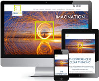
As with all sites we now build, the site is fully responsive to the device being used to view it. We used a fluid layout with carefully placed media queries to allow the design to respond to differing screen widths. Viewed on an iPad in landscape, the placement of content is the same as on a desktop.
On smaller screens, the viewport is restricted, so we re-arrange the display again and remove some elements – in this case, the size of the main image is reduced and we remove the side images as they're not core content that mobile users with restricted bandwidth need.
In implementing a responsive design, we can ensure that for every possible view - desktop, tablet or smartphone, in landscape or portrait orientation - the website content is displayed for an optimal viewing experience.
The design process was very quick, with Revolution Software picking up on my wishes from the initial briefing we had straight away. They designed for platform compatibility from the outset made some valuable suggestions throughout the design and build. I'm very pleased with end result, with the project delivered on time and in budget. Very good job done, thank you.


